


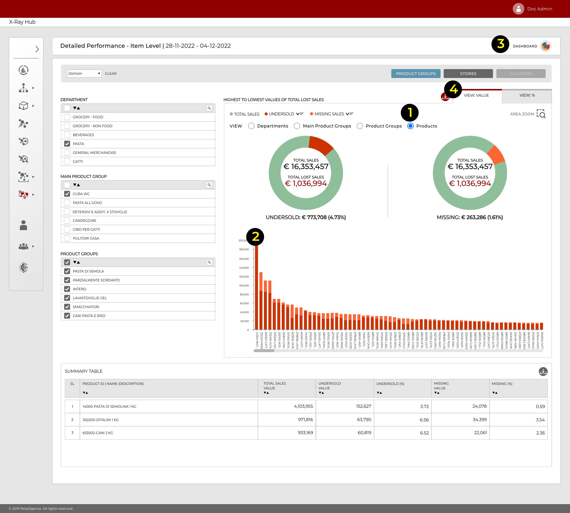
- Within this view, selecting the “Products” button (1 in Figure below) displays all the items with lost sales in descending order
- The red bars indicate undersold sales and the orange missing sales (2 in Figure below)
- The dashboard icon appears on all of the sub menu screens within the X RAY HUB returning you to the Dashboard (3 in Figure below)
- The View actual and View % tabs (4 in Figure below) switch the view between the items with highest lost sales in cash and % terms respectively
- Hovering on any of the bars, gives a pop up information with more details about each item
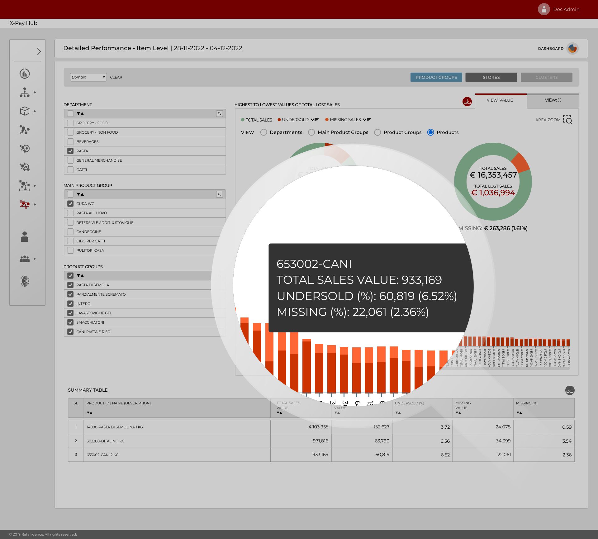
- The lower part of the screen below the graph is a summary table providing details of each of the items. Each column in this table may sorted according to the users preference using the sort buttons (1 in Figure below)
- Additionally, clicking the download button (2 in Figure below) immediately downloads the table into excel for continued analysis

Sample of the excel file
